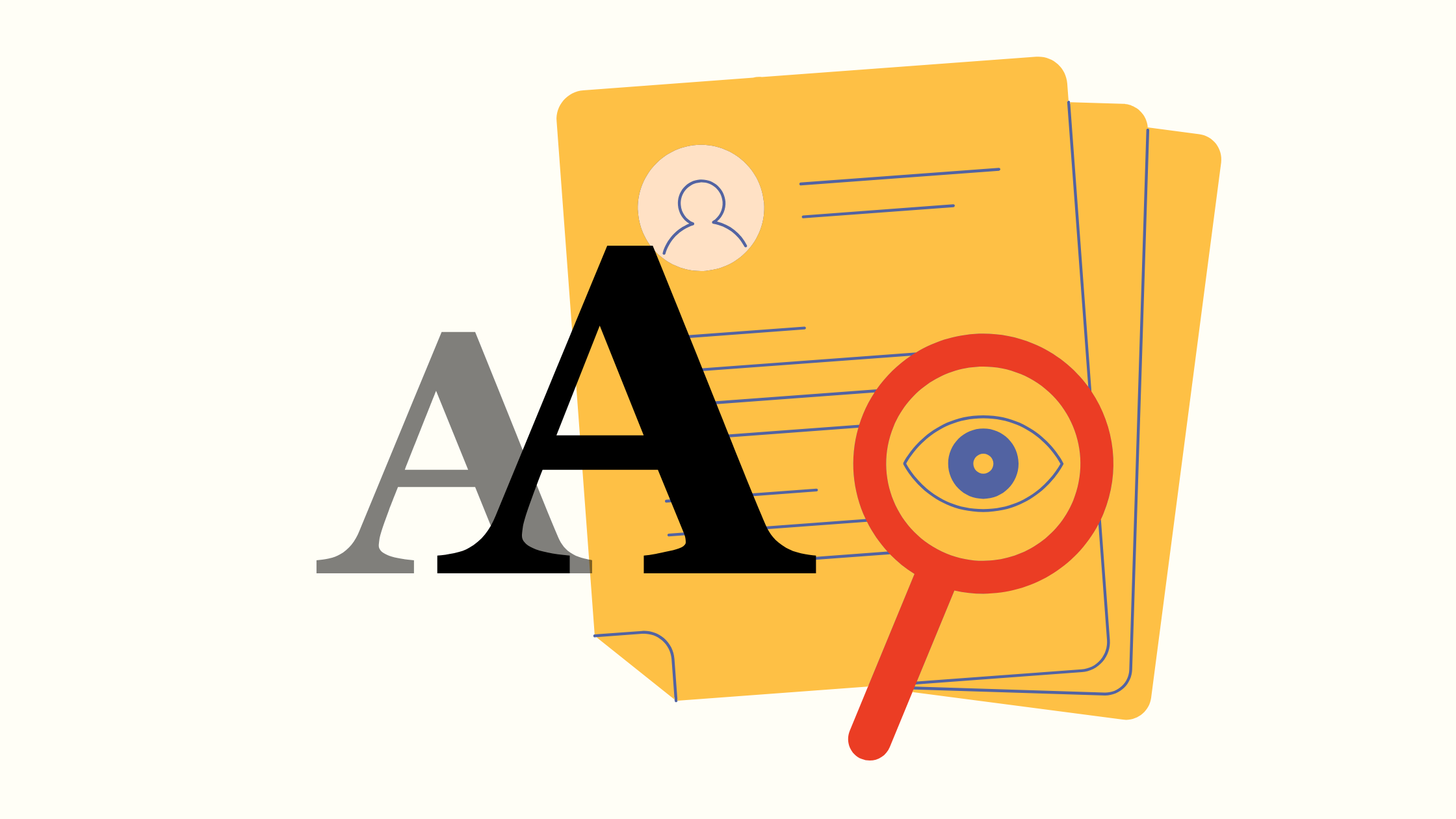
Does Your Resume Font Really Matter? (Yes, and Here’s Why)
Your resume's font is the first impression you make. Discover the best fonts to use, what size to choose, and the key formatting rules that will get you noticed by recruiters.
Why Your Resume's Font Is a Bigger Deal Than You Think
Think of a hiring manager sifting through a hundred applications. Their eyes are tired. They’re scanning for keywords and key qualifications. Your resume has about seven seconds to make an impact.
Here’s why your font choice is critical in that tiny window:
- Readability: A clean, clear font makes it effortless for a recruiter to absorb your career story. If they have to squint or struggle, they’re more likely to move on.
- Professionalism: Your font sets a professional tone before a single word is read. Classic, standard fonts signal that you are a serious candidate.
- ATS Compatibility: Many companies use Applicant Tracking Systems (ATS) to scan resumes for keywords. These systems can get confused by overly decorative or obscure fonts, potentially discarding your application before a human ever sees it.
The Great Debate: Serif vs. Sans-Serif Fonts
You'll hear these two terms a lot. The difference is simple, and both categories have excellent options.
Team Serif: Classic and Traditional
Serif fonts have small decorative lines (or "feet") at the ends of their strokes. They have a classic, established feel and are often associated with print, books, and academia. They can make your resume feel authoritative and trustworthy.
Best for roles in: Academia, law, publishing, and other traditional industries.
Team Sans-Serif: Modern and Clean
"Sans" literally means "without." These fonts lack the decorative feet, giving them a clean, crisp, and modern appearance. They are incredibly easy to read on digital screens, which is where most recruiters will view your resume.
Best for roles in: Tech, marketing, design, and most contemporary corporate fields.
Our Top Picks: The Best Fonts for Your Resume
You can’t go wrong with these recruiter-approved, ATS-friendly classics.
- Calibri: A modern sans-serif font that is the default in many Microsoft programs. It's familiar, clean, and highly readable.
- Georgia: A friendly and elegant serif font that was designed specifically for on-screen clarity. It's wider than Times New Roman, making it feel more open and easier to read.
- Helvetica: A true design classic. This sans-serif font is beloved for its clean, neutral look that exudes professionalism.
- Garamond: A timeless and graceful serif font. It’s more elegant and uses less space than many other fonts, allowing you to fit more on the page without it looking cramped.
- Verdana: A sans-serif font known for its excellent readability, even at small sizes. Its wide letters make it a very safe and clear choice.
Beyond the Font: Essential Resume Formatting Tips
Choosing the right font is just the start. The best resume designs use simple formatting to guide the reader’s eye.
Find the Sweet Spot for Font Size
Your font size should be large enough to read comfortably but not so large that your resume spills onto a third page.
- Body Text: Stick to 10-12pt. Anything smaller is a strain on the eyes.
- Headings (Your Name, Section Titles): Use a slightly larger size, around 14-18pt, to create a clear visual hierarchy.
Keep It Consistent
Choose one font and stick with it. Using multiple fonts on a resume looks messy and unprofessional. You can create emphasis and structure by using bold, italics, and different font sizes from the same font family.
Give Your Words Room to Breathe
White space is your best friend. A crowded resume is intimidating.
- Margins: Set your margins between 0.75" and 1". This creates a clean frame around your content.
- Line Spacing: Use a line spacing of around 1.15 to ensure your paragraphs don't feel like a solid wall of text.
Putting It All Together
Your resume’s design is the silent partner to its powerful content. By choosing a clean font like Calibri or Georgia and applying simple formatting rules, you ensure your first impression is a professional one.
Once your formatting is flawless, you can focus on making your content shine. If you're looking for an easy way to build a professional resume from the ground up, the templates and format tools at resumost.com ensure your layout is perfect every time, letting you focus on what really matters—your accomplishments.
© 2026 Resumost.
We love that you're reading our work! Please note that this content is our own. If you'd like to share or re-post it, please reach out to us for permission first. Unauthorized scraping of this site is not permitted.